Use these data-backed tips to make your donation page convert more visitors and increase revenue.
Since 2014 the charitable sector has seen online revenues grow by 80%.
As online giving continues to grow, it’s vital that charities and non-profits have an optimized online giving tool to translate interest into dollars.
Here are our top 8 tips to optimize your organization’s donation page
1. Brand your experience
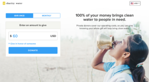
This may seem basic, but many non-profits use third-party donation tools with no organizational branding.
According to the Nonprofit Source – “custom-branded donation pages nested inside a non-profit’s website raise 6X more money.”
Customize the look and feel of your donation experience, so it matches your branding and overall website. When you send a visitor from your site to the donation page, they need to feel as though they are in the right place…make it happen, and they’ll reward you with more completed donations.
2. Recommend giving amounts
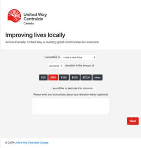
You want to make the giving experience as easy as possible for visitors – one way to do that is by suggesting an appropriate giving amount.
In a recent Frontstream study, when potential donors were presented with recommended giving amounts on a non-profit website, it resulted in a 12% increase in the average donation amount. The study would suggest that these recommended giving levels were helping to tell donors what amount is “appropriate” to give.
Look at your historical giving data and set appropriate ‘suggested’ giving defaults on your online donation page – test out several different amounts and see what works best.
3. Make it great for mobile
If your donation page isn’t mobile-friendly, you are losing money.
51% of people who visit a nonprofit’s website do so on a mobile device according to the Nonprofit Source.
Really think through the user experience on a mobile device – test it out for yourself and make adjustments if necessary. It should be easy to navigate, have built-in supports to simplify clicking and prefilling information and have a readable font size.
4. Break it out into steps
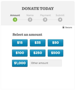
There are a few schools of thought when it comes to the donation page itself.
At Rise Up Strategies, we recommend what is statistically the most effective approach to donation experiences, which focuses on breaking out the experience into bite-sized chunks.
This approach was tested and validated during Barrack Obama’s 2008 and 2012 campaigns.
The digital company that helped optimize the campaign did thousands of tests, and the results showed that the most effective donation experience was a ‘sequential’ or step by step experience.
This approach increased donation conversions by 49% and sign up conversions by 161%…and it’s still used today by industry leaders, including Amazon.
The thinking behind this approach is to create a quick and simple experience but not overwhelm visitors with too many fields on one screen. Keep the pages simple, almost boring in appearance, take visitors by the hand and walk them through the donation experience towards the completion.
5. Minimize fields – remove distractions
The goal of the donation page is to convert – remove any additional information or offers that aren’t vital to completing the transaction.
Added links or information will just distract users– you want to move them through to completion as quickly as possible, so take all the extras out and keep visitors focused on the task you want them to complete.
Trust seals specific to the processing of credit cards, or other seals of approval relevant to your nonprofit’s ratings/status with well-known organizations can be an excellent way to reinforce trust and encourage completions.
Tip: Ensure you deactivate any links out – you don’t want people leaving their donation experience to read up on the charitable ratings.
6. Measure and Test
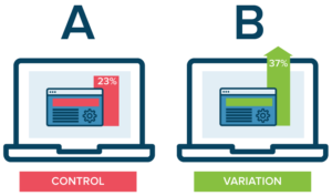
Ensure that you have full tracking capabilities in place connecting your donation experience to Google Analytics or another web analytics tracking tool. You need to be able to see what channels are driving visitors to your donation page and how they are interacting with it while they are there.
Additionally, put a testing strategy in place – try out different colours, wording, trust seals or other variables and see how they impact conversion rates on your donation page…always stay curious.
7, Have a plan for what happens next
When a visitor makes a donation that is just the start of their journey with your organization, next, you want to focus on retaining and growing that donor. Email drip campaigns and impact reporting are two critical pieces in the donor journey. Have a plan in place for what comes next.
8. Look to for-profits for inspiration
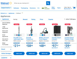
Visitors won’t compare their digital experience with you to other charities – more likely they will compare it with experiences they have on a daily basis with Walmart, Amazon, Old Navy or other large organizations.
Nonprofits should be looking to these companies when searching for inspiration. Your organization may not have the same budget but you can find ways to bring innovation to your tools in some cost-effective ways.
Want to supercharge your organization’s donation experience? We can help you.
Contact us today and let’s get started.